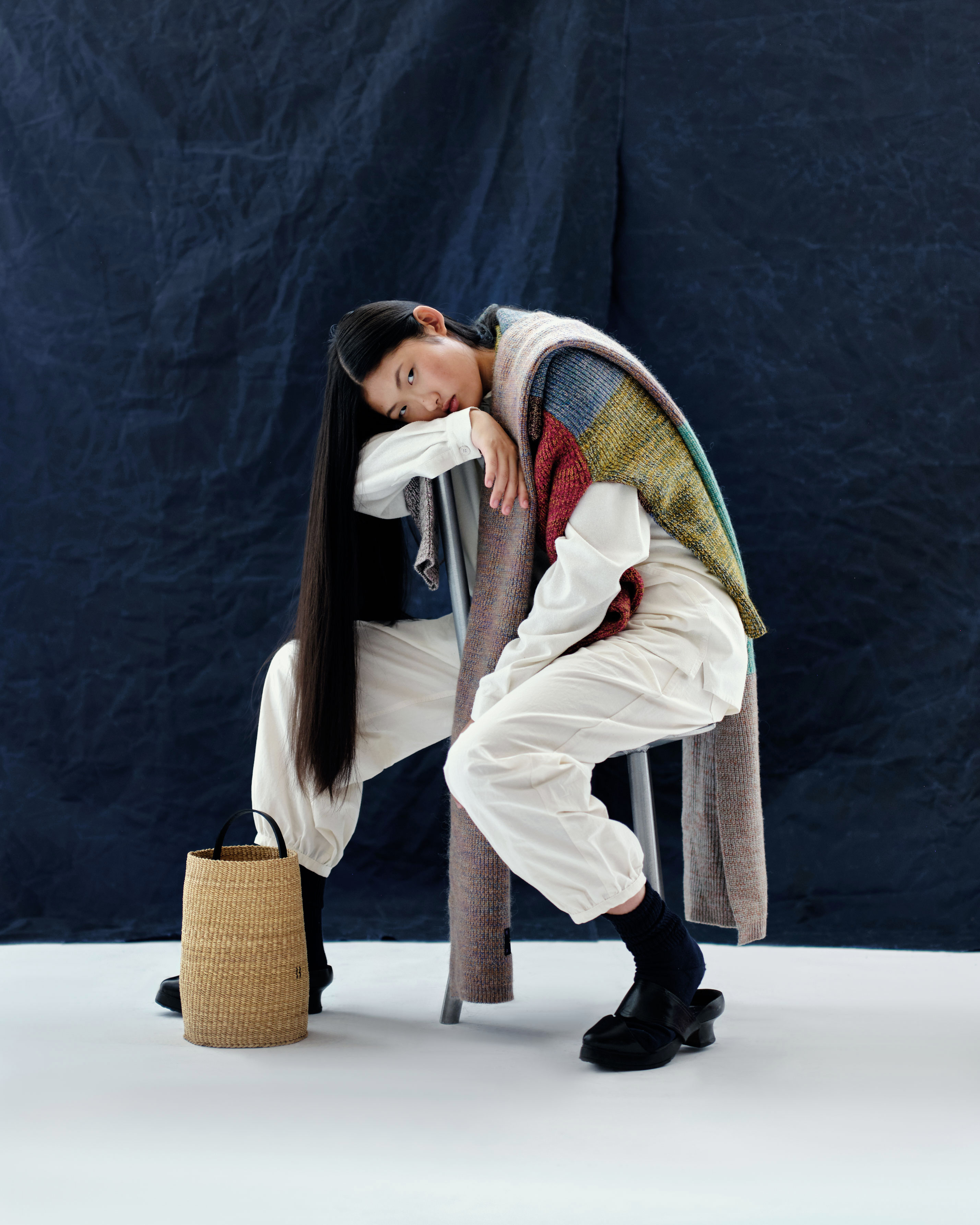
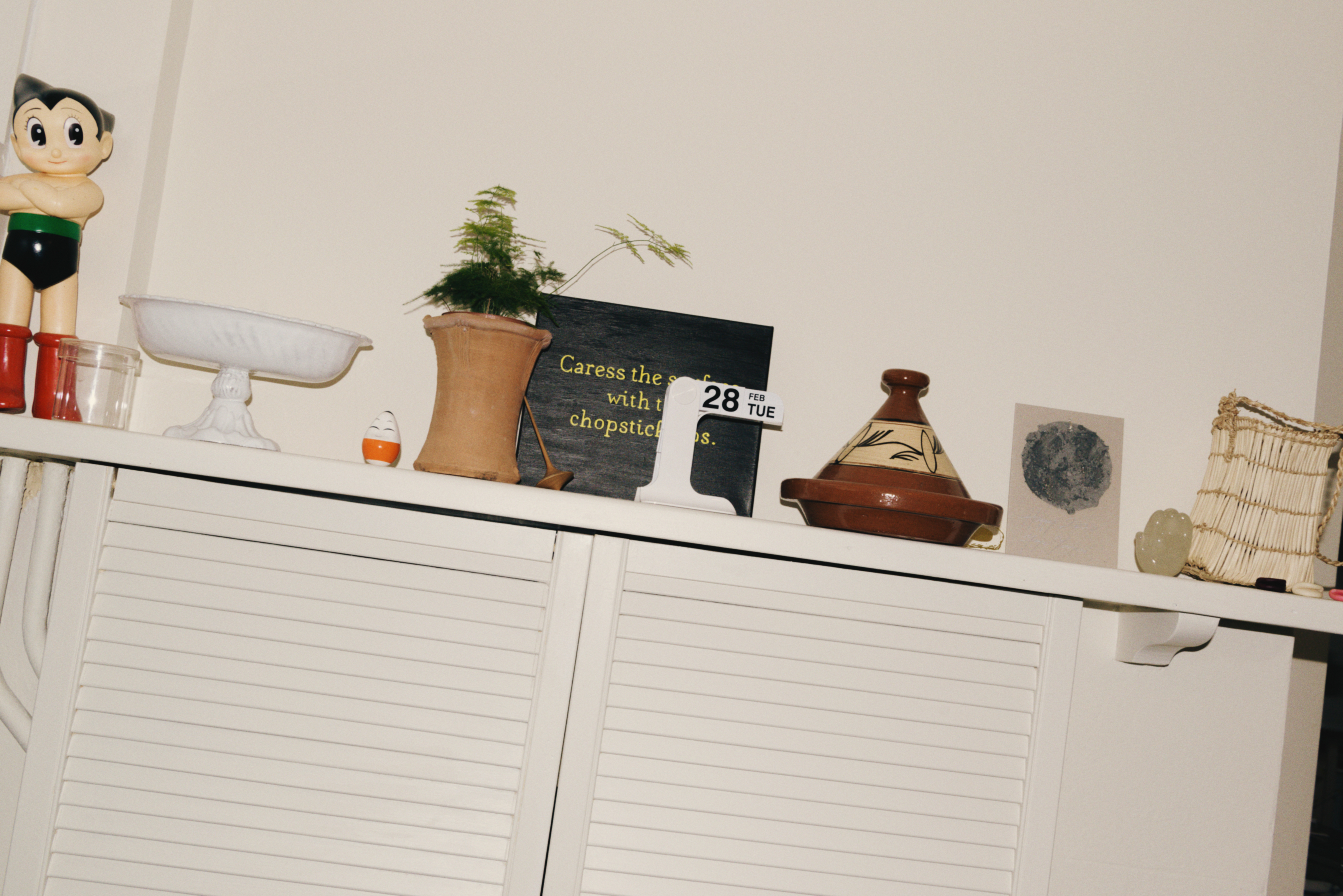
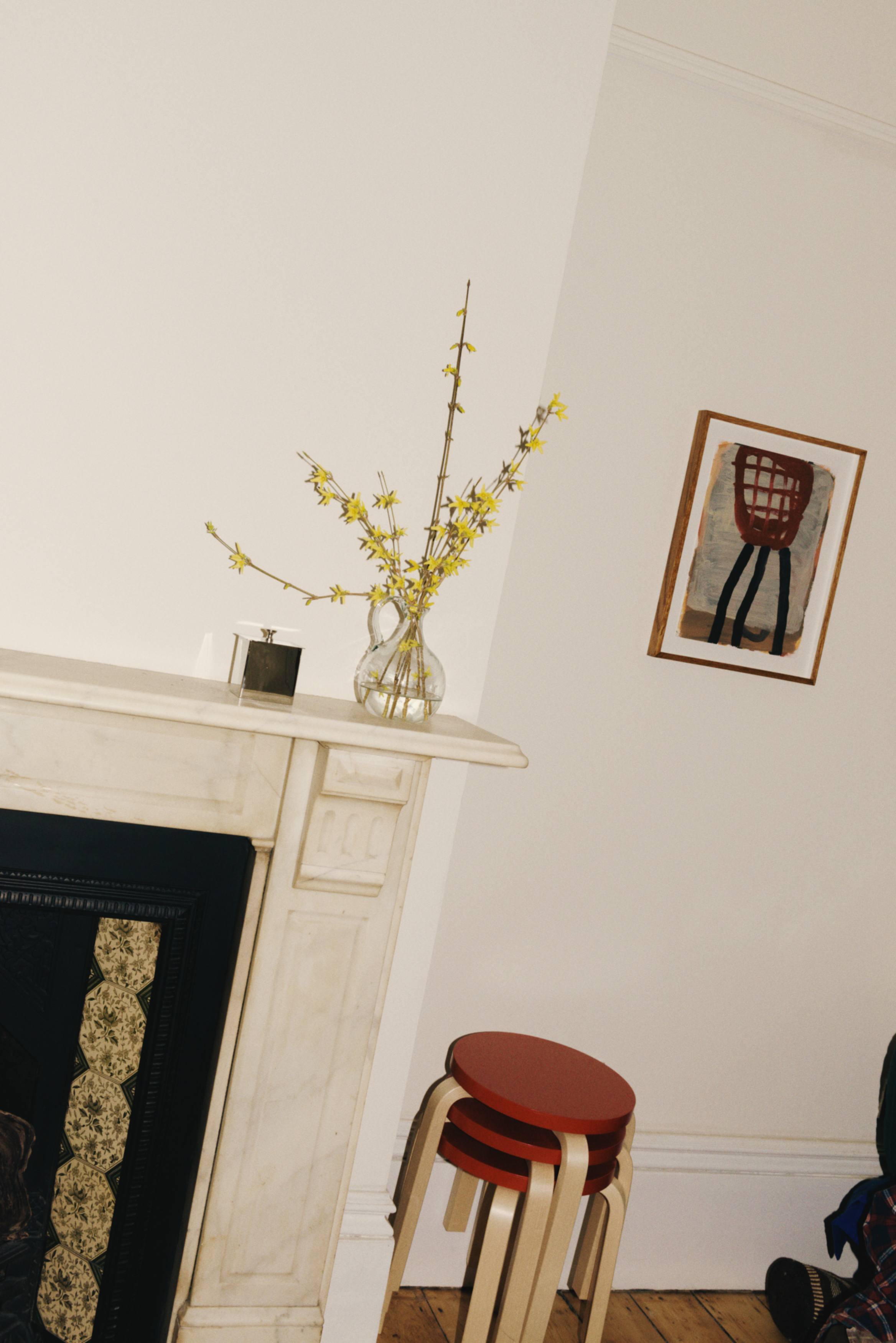
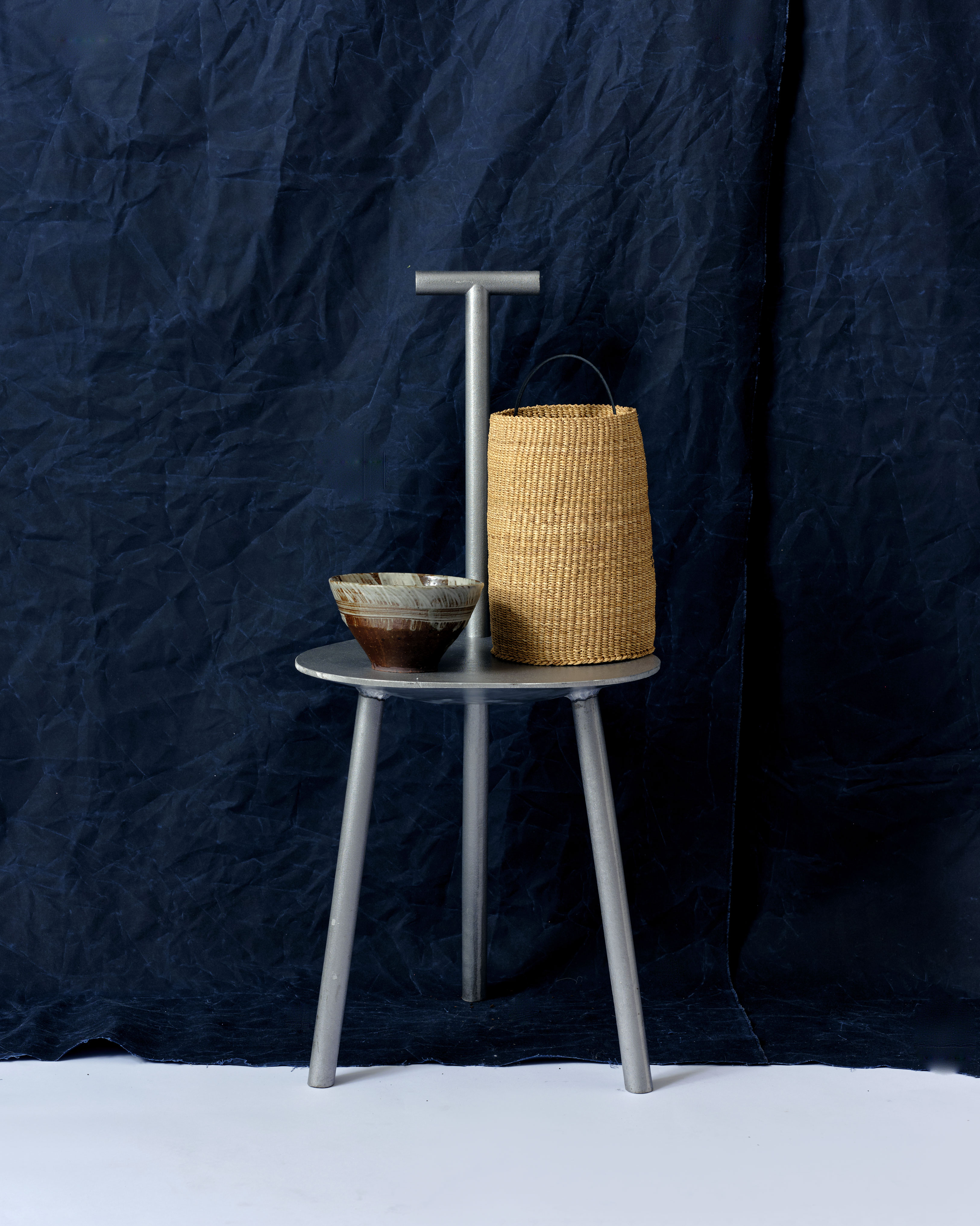
Hato Store
Photo: Shahram Saadat, Jacob Lillis, Jack Batchelor, Tim Bowditch, Hannah Claydon
2020–2024
A variety of still life and model imagery captured over a four year period for Hato Store; a concept store formed in 2020 as part of the HATO brand. Purposes focus mainly on ecommerce marketing use; newsletters, socials and landing pages.
Hato Store is a brand rooted in experimentation; not bound to one specific style, the photography output seeks to balance luxury product with playful and considered output.
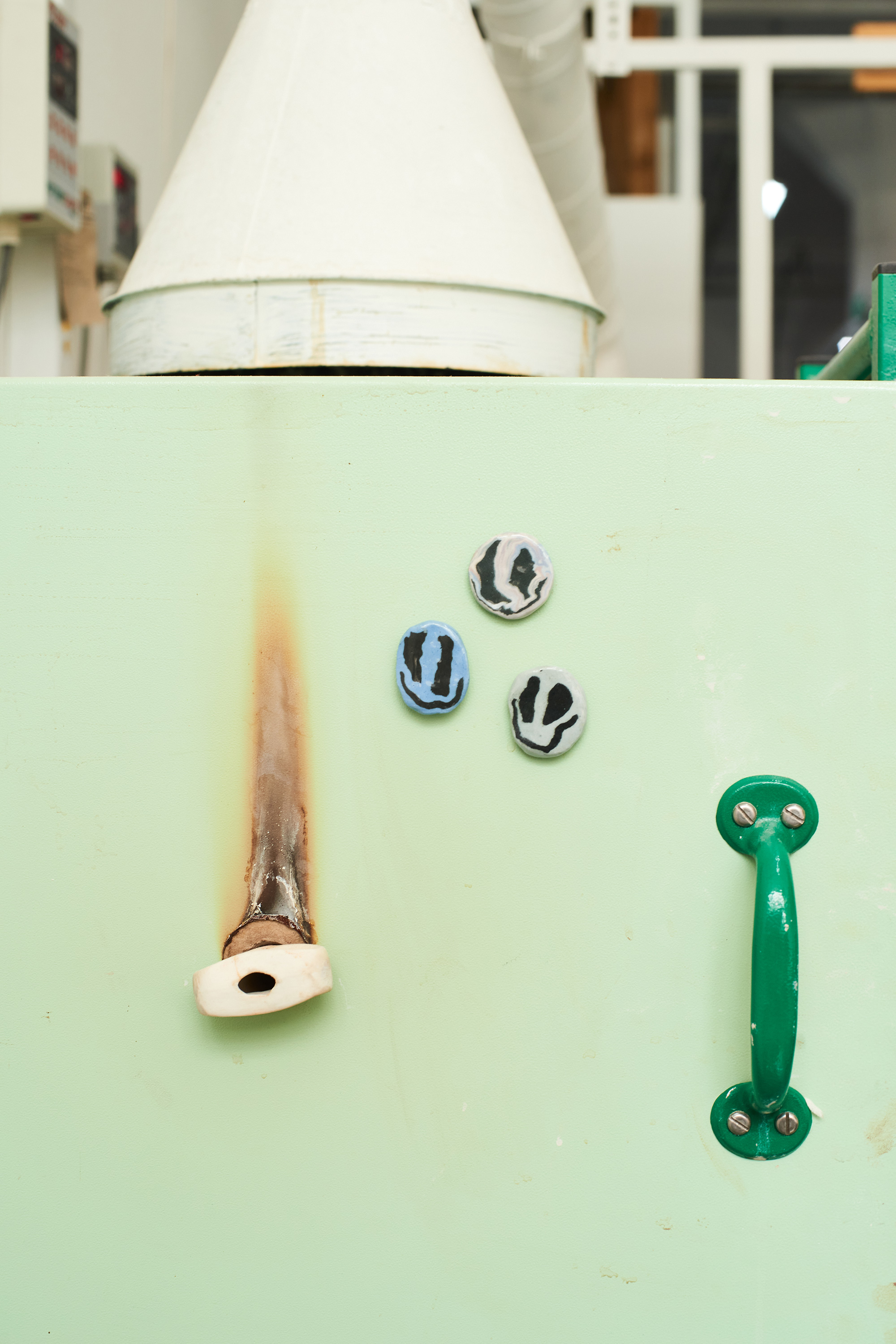


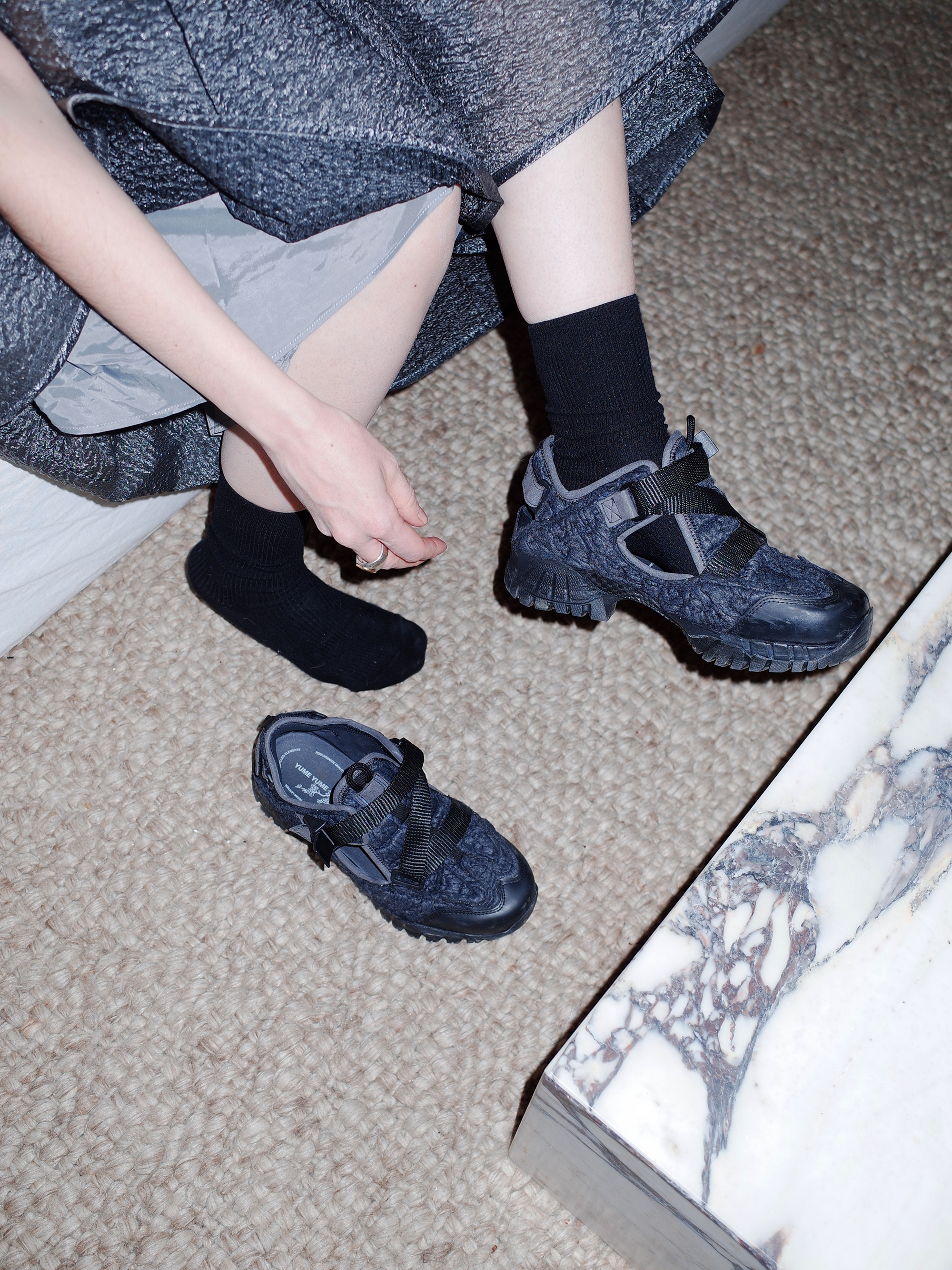


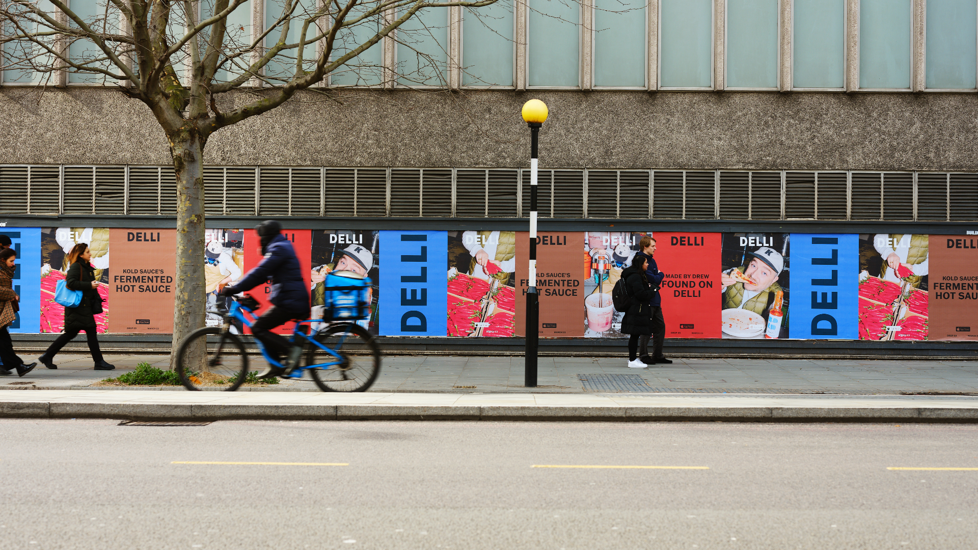
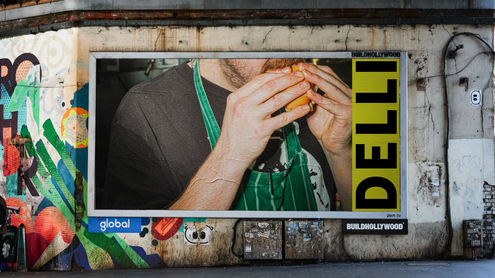
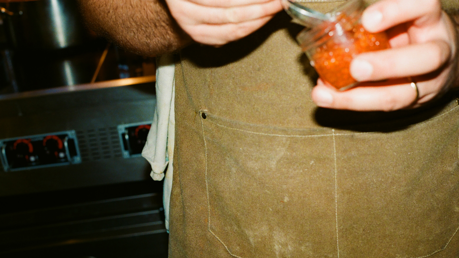
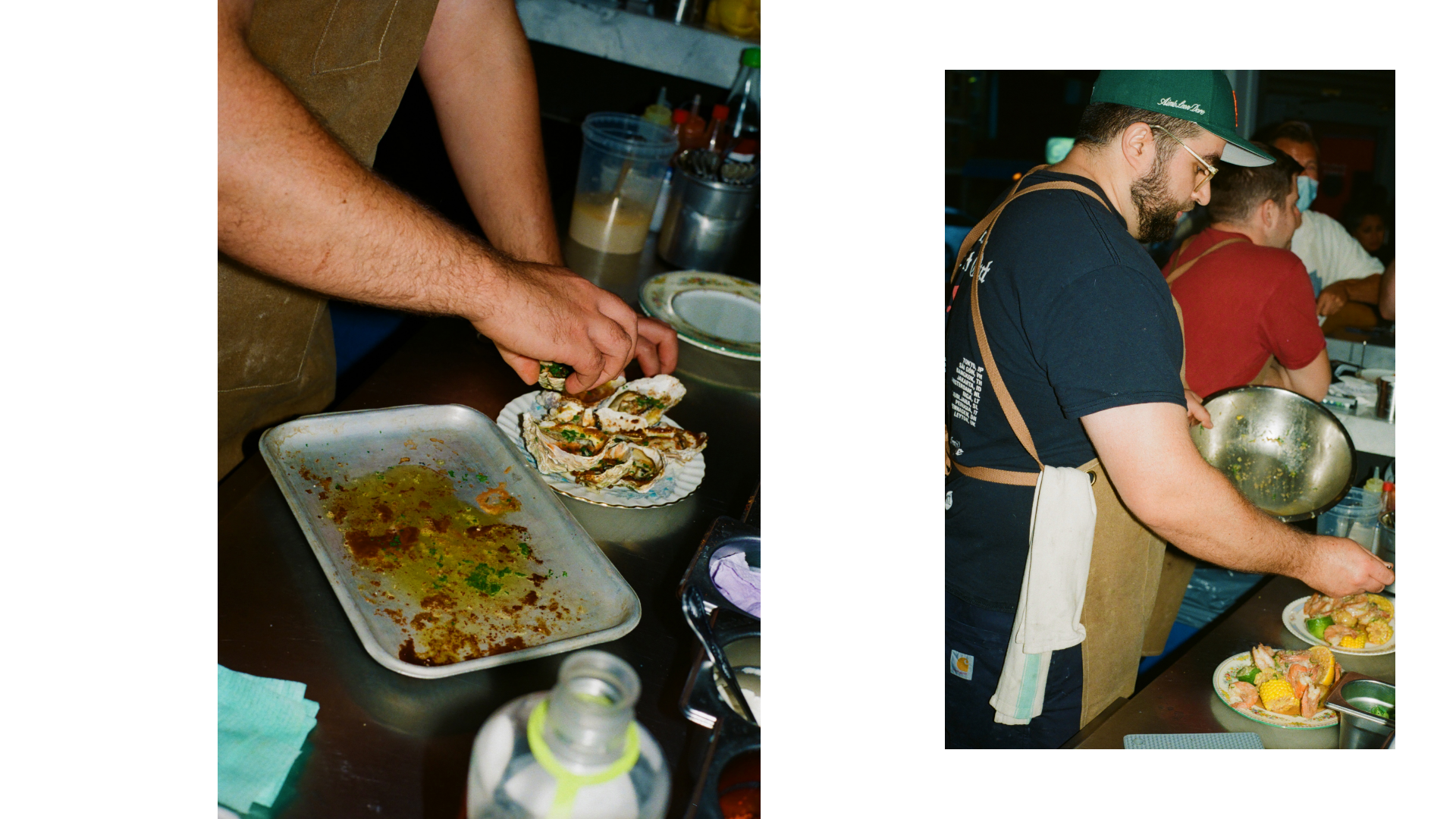
DELLI
HATO
Photo: Liam Hart, Lars Brønseth, Shahram Saadat
2022–2024
DELLI is a new food app created by Depop founder Simon Beckerman. HATO were approached to create a visual identity for the brand, as well as the app and website design for their internal team to develop. Explore DELLI here.
We first looked into the history of Delicatessens around the world, finding final inspiration in the US for the DELLI wordmark. The logo sits atop earthy yet bright palettes that reference some of the masters of Italian design such as Enzo Mari. To tie it together, the photography direction is real, honest and a snapshot into the moment; no ‘can you just hold that there for a sec.’


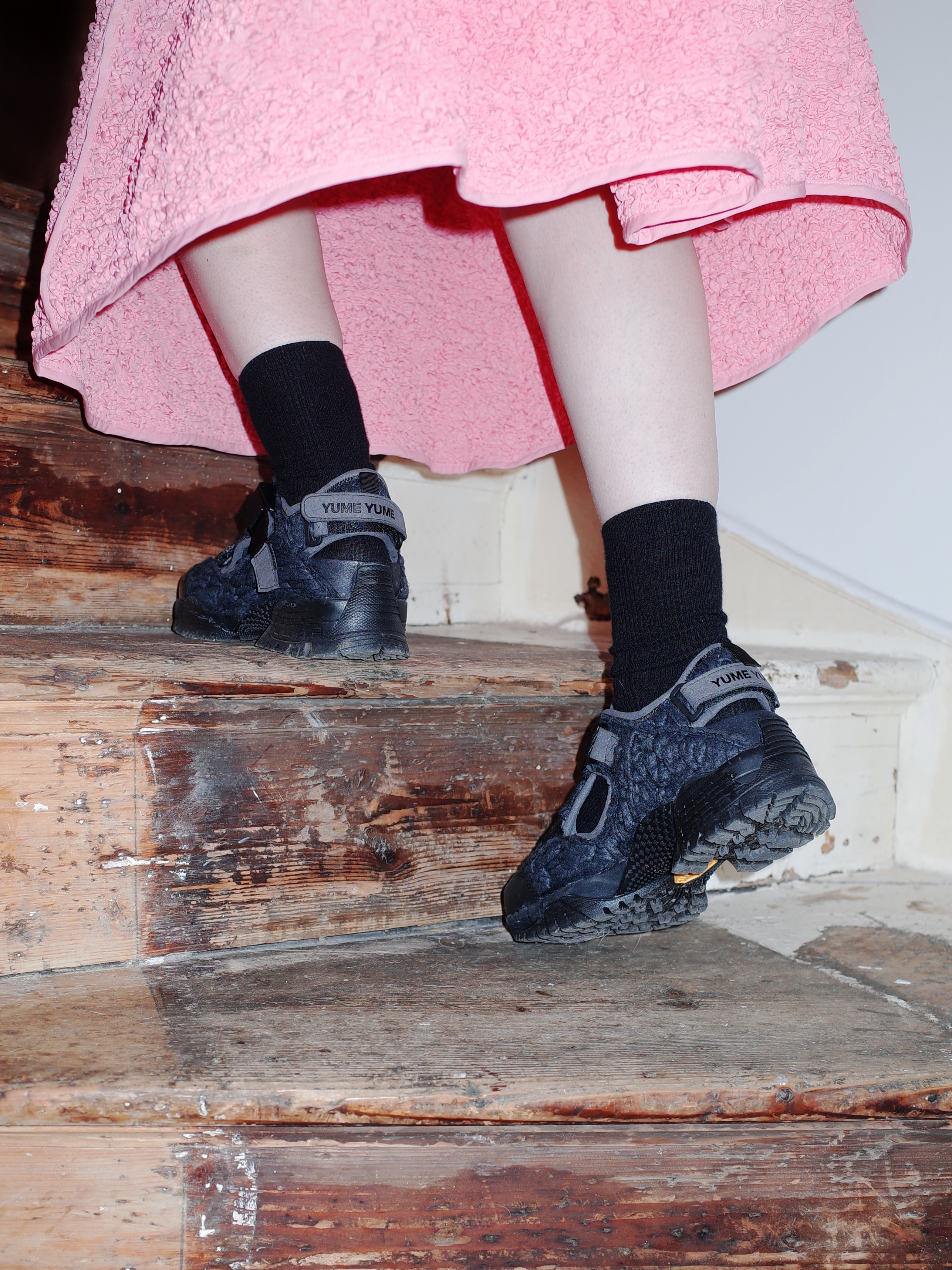
Capture One: Rebrand & Global App Campaign
HATO, Capture One
Production: Pavilion Works
Photo: Kayla Connors
Stylist: Flo Arnold
Makeup: Verity Cumming
Hair: Joe Burwin
Model: Lydia Adeyemi
Animation: Connor Campbell Studio
Production: Pavilion Works
Photo: Kayla Connors
Stylist: Flo Arnold
Makeup: Verity Cumming
Hair: Joe Burwin
Model: Lydia Adeyemi
Animation: Connor Campbell Studio
2023
In late 2022, HATO were approached to craft a rebrand and global campaign for professional photography software Capture One. The brief for the brand was to engage with the talented and creative users that create their work with the tool, but seldom speak about it. The global video campaign for the new iPhone app launch continued this theme, whilst targeting a more commercial-minded US audience. Please note parts of this project have not yet launched.
Details to the rebrand include a custom mono typeface and wordmark, inspired by the engraved lettering and numerals on original Phase One lenses, as well as a design system based on true-to-life actions undertaken whilst shooting. For the campaign, we targeted photographers who shoot outdoors to prove Capture One isn’t just for the studio. The visuals chosen focused on a fashion-led shoot that mirrored the concept of ‘Freedom to Move’.


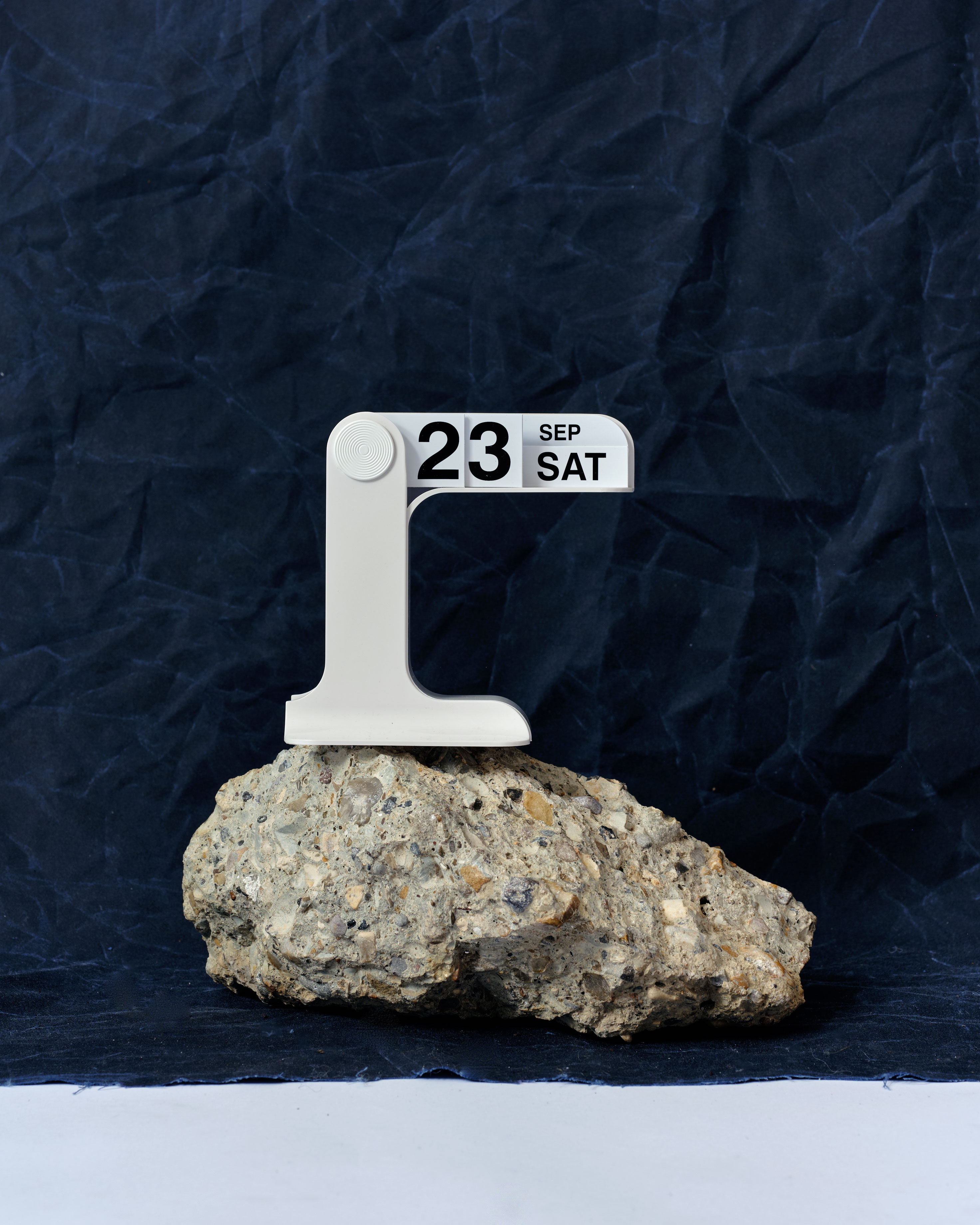
MM:NT
HATO
PW/c
PW/c
2022–2024
MM:NT is a Berlin-based apart-hotel focused on targeting a specific audience and ultra fast growth. HATO were approached by the strategist on the project to help define the brand story and visual output, including naming, logo, imagery, and brand pillars. Explore MM:NT here.
The brand was centered around moments that feel fleeting when travelling, focusing on a digital clockface as a visual touchpoint for the concept. As the hotel is centered around ‘everything you need and nothing you don’t’, we looked to minimalist design masters such as Dieter Rams’ to help shape the brand’s considered visuals.


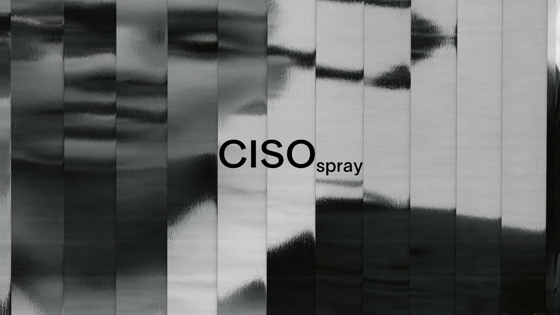
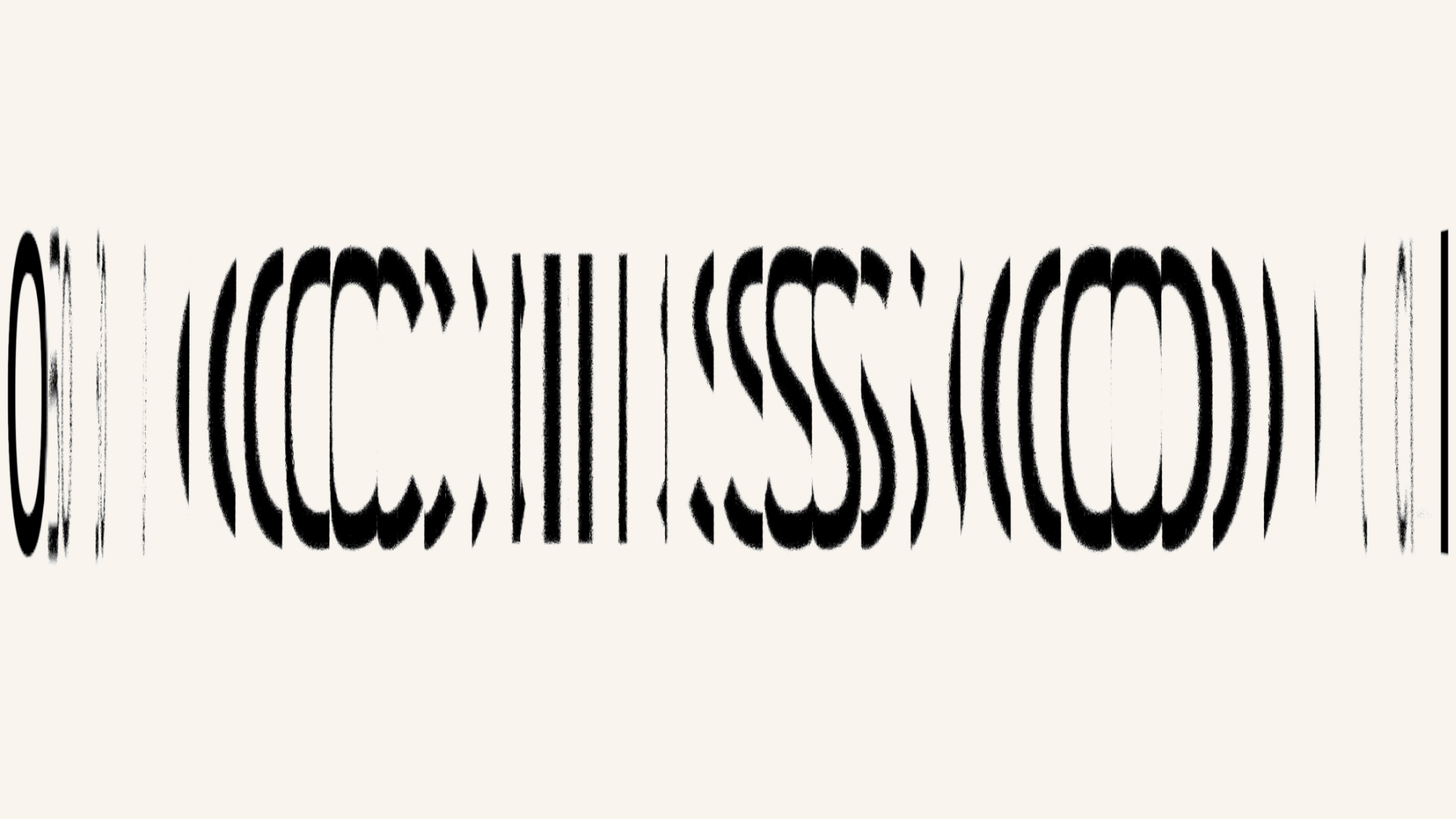
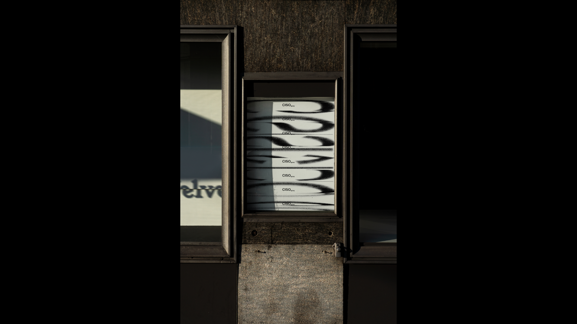
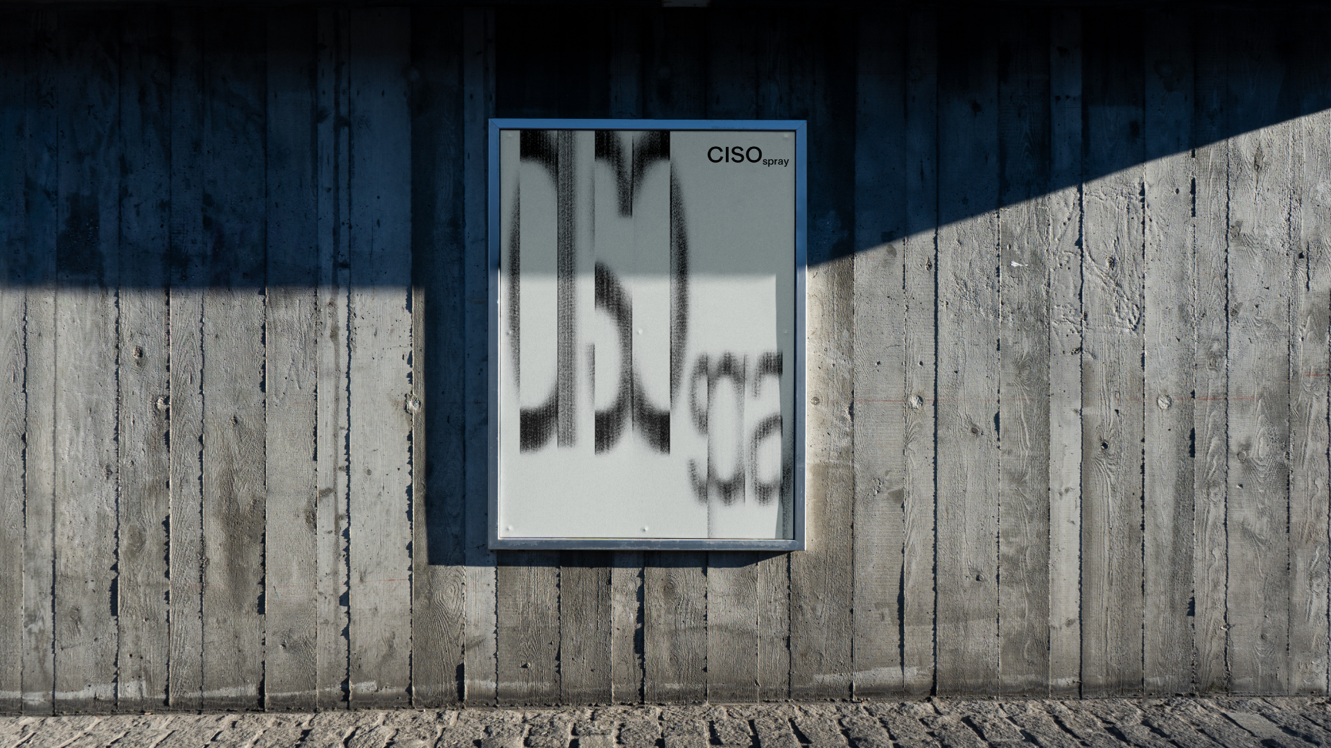
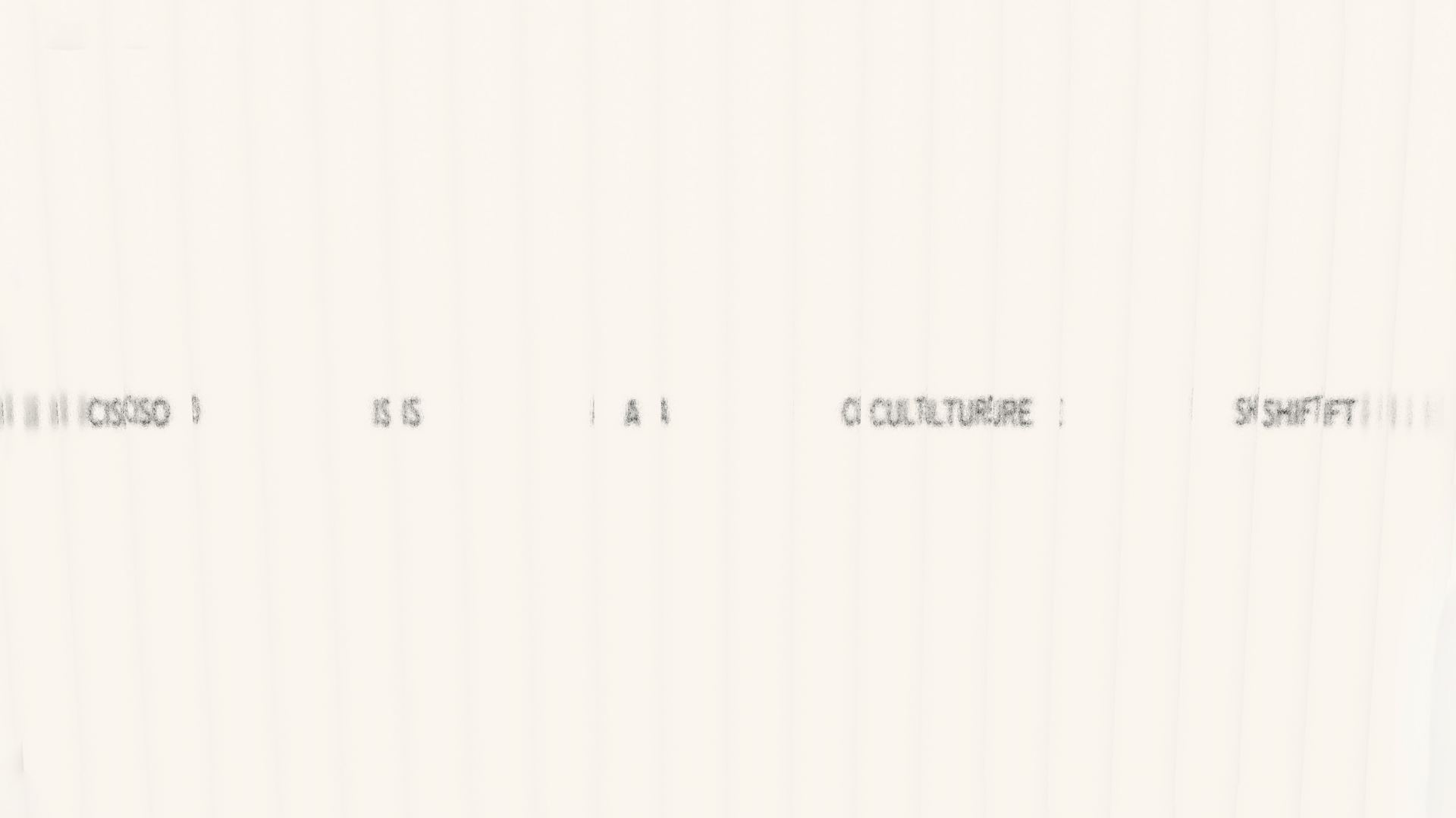
CISO
HATO
January 2022
CISO is an upcoming luxury brand of CBD spray, entering the market as the purest form of CBD. HATO were commissioned to create the branding and website for the spray from a Parisian client, launching soon in Dover Street Market Paris, targeting a fashion-led audience. Please note this project is not yet live.
Working with the spray’s crystal glass bottles, HATO created a digital tool to feed images through and manually tweak to give the look of glass. The art direction takes note of iconic understated 90’s luxury brands to target the fashion audience, whilst the colour palette plays on the shades of pink the spray goes under certain conditions.