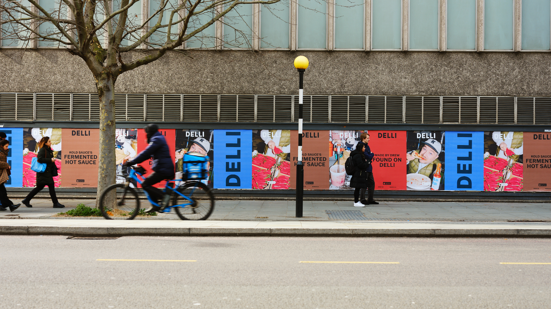
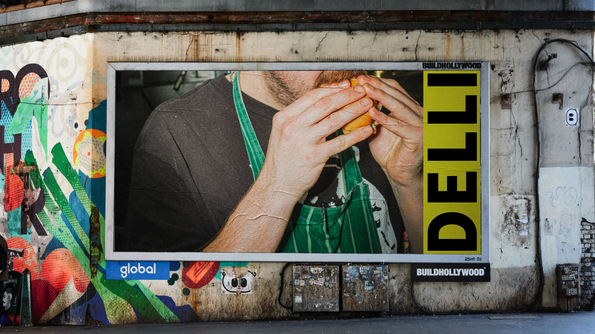
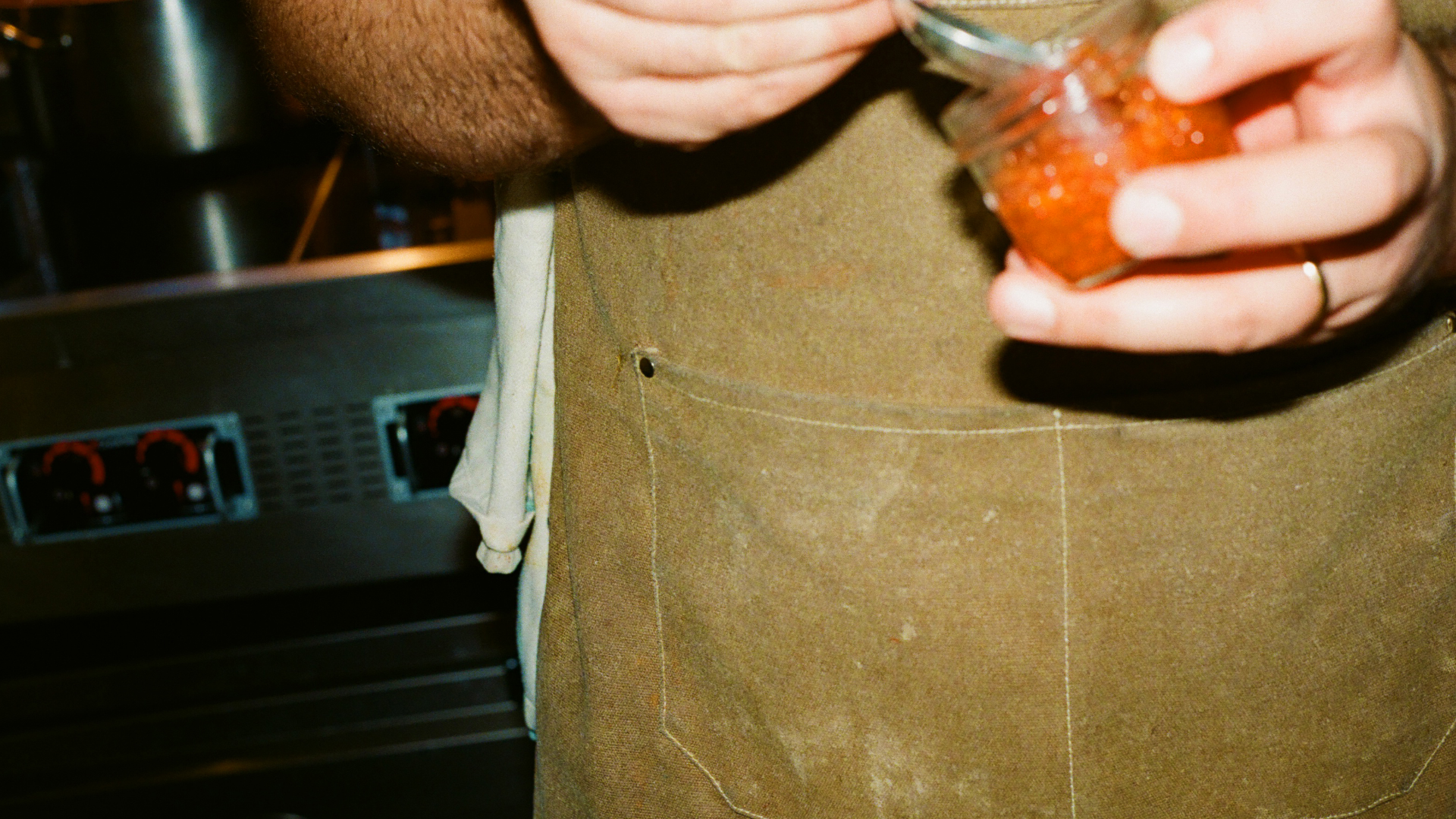
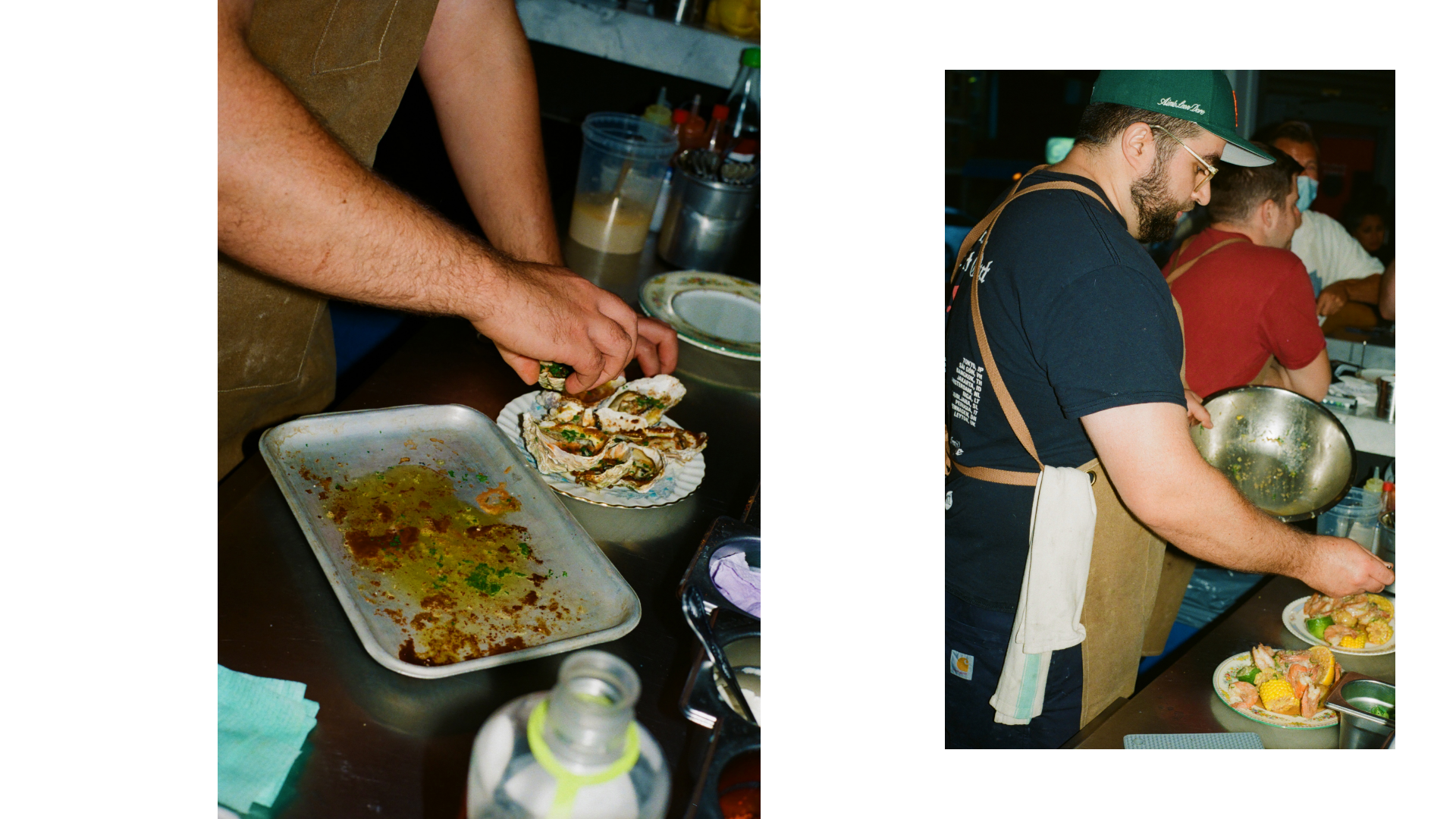
DELLI
HATO
Photo: Liam Hart, Lars Brønseth, Shahram Saadat
June 2022
DELLI is a new food app created by Depop founder Simon Beckerman. HATO were approached to create a visual identity for the brand, as well as the app and website design for their internal team to develop. Explore DELLI here.
We first looked into the history of Delicatessens around the world, finding final inspiration in the US for the DELLI wordmark. The logo sits atop earthy yet bright palettes that reference some of the masters of Italian design such as Enzo Mari. To tie it together, the photography direction is real, honest and a snapshot into the moment; no ‘can you just hold that there for a sec.’


Capture One: Rebrand & Global App Campaign
HATO, Capture One
Production: Pavilion Works
Photo: Kayla Connors
Stylist: Flo Arnold
Makeup: Verity Cumming
Hair: Joe Burwin
Model: Lydia Adeyemi
Animation: Connor Campbell Studio
Production: Pavilion Works
Photo: Kayla Connors
Stylist: Flo Arnold
Makeup: Verity Cumming
Hair: Joe Burwin
Model: Lydia Adeyemi
Animation: Connor Campbell Studio
May 2023
In late 2022, HATO were approached to craft a rebrand and global campaign for professional photography software Capture One. The brief for the brand was to engage with the talented and creative users that create their work with the tool, but seldom speak about it. The global video campaign for the new iPhone app launch continued this theme, whilst targeting a more commercial-minded US audience. Please note parts of this project have not yet launched.
Details to the rebrand include a custom mono typeface and wordmark, inspired by the engraved lettering and numerals on original Phase One lenses, as well as a design system based on true-to-life actions undertaken whilst shooting. For the campaign, we targeted photographers who shoot outdoors to prove Capture One isn’t just for the studio. The visuals chosen focused on a fashion-led shoot that mirrored the concept of ‘Freedom to Move’.


MM:NT
HATO
PW/c
PW/c
September 2022
MM:NT is a Berlin-based apart-hotel focused on targeting a specific audience and ultra fast growth. HATO were approached by the strategist on the project to help define the brand story and visual output, including naming, logo, imagery, and brand pillars. Explore MM:NT here.
The brand was centered around moments that feel fleeting when travelling, focusing on a digital clockface as a visual touchpoint for the concept. As the hotel is centered around ‘everything you need and nothing you don’t’, we looked to minimalist design masters such as Dieter Rams’ to help shape the brand’s considered visuals.


Ministry of Sound
HATO
January 2024
HATO recently started work on a new digital identity for renowned London club Ministry of Sound. After hosting workshops to find out insights from club-goers who avoid MoS, we realised the club required repositioning in order to appeal to a new generation of ravers. Please note this project is in draft design phase and has not yet launched. The below content is work in progress.
For the website, we proposed creating an integrated space connected to the physical club, allowing features like ticket purchases to be streamlined without using third-party sites. The homepage would digitally represent MoS’s iconic logo, showcasing club-goers' videos to reflect the in-club experience. We suggested replacing the outdated VIP model with a members area, offering exclusive merch, queue jumps, and playful digital features. Ideas included changing toilet light colors via the website and a hidden message board for club-goers.


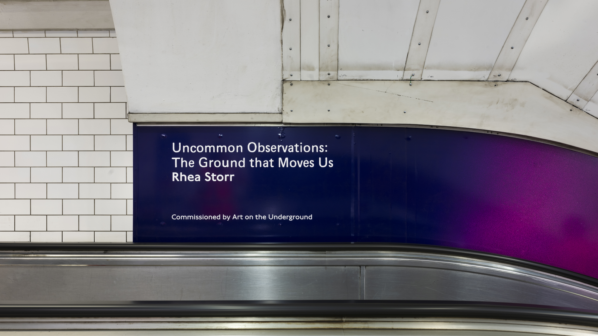
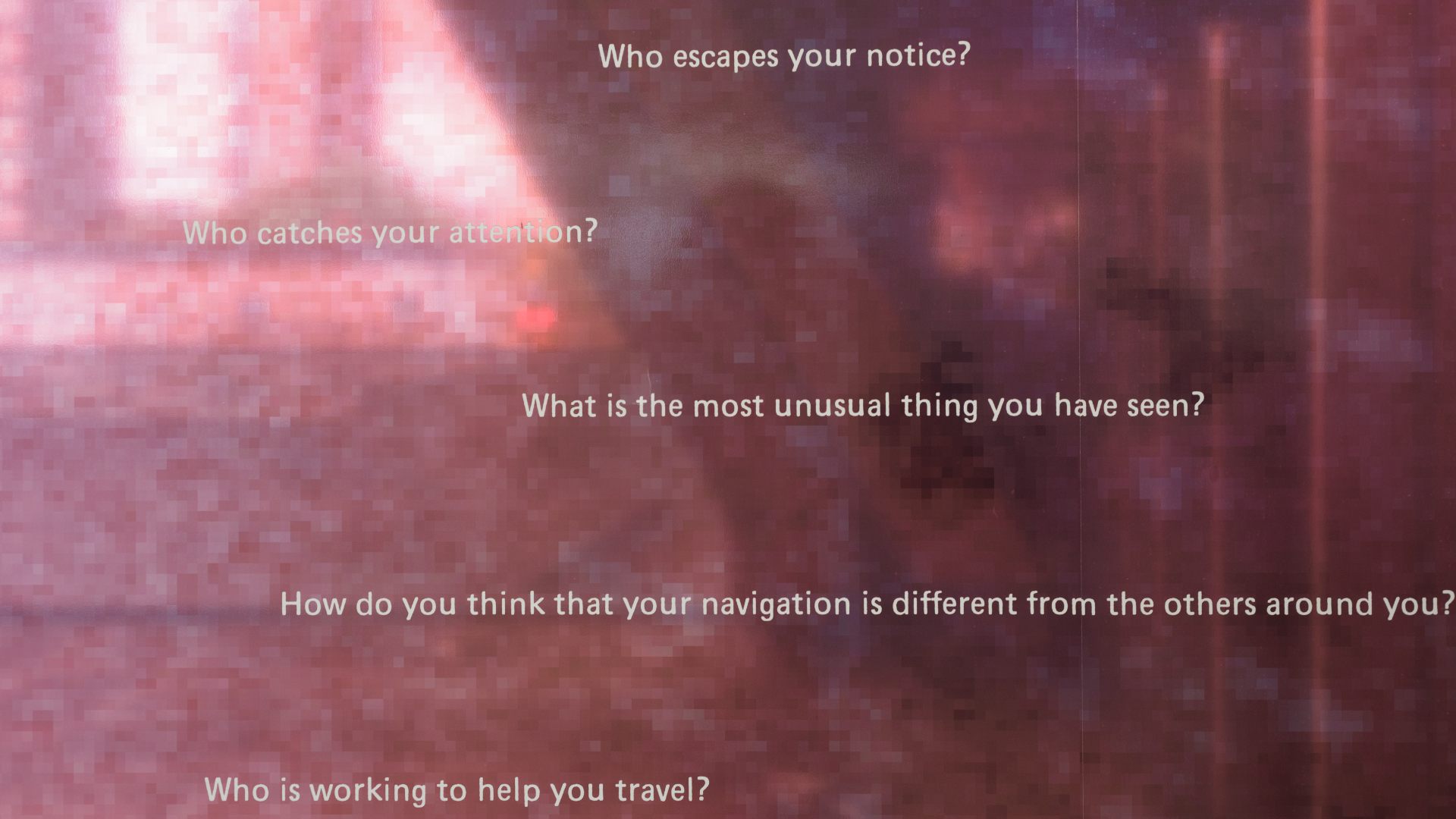
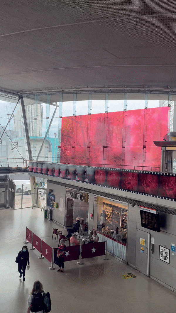
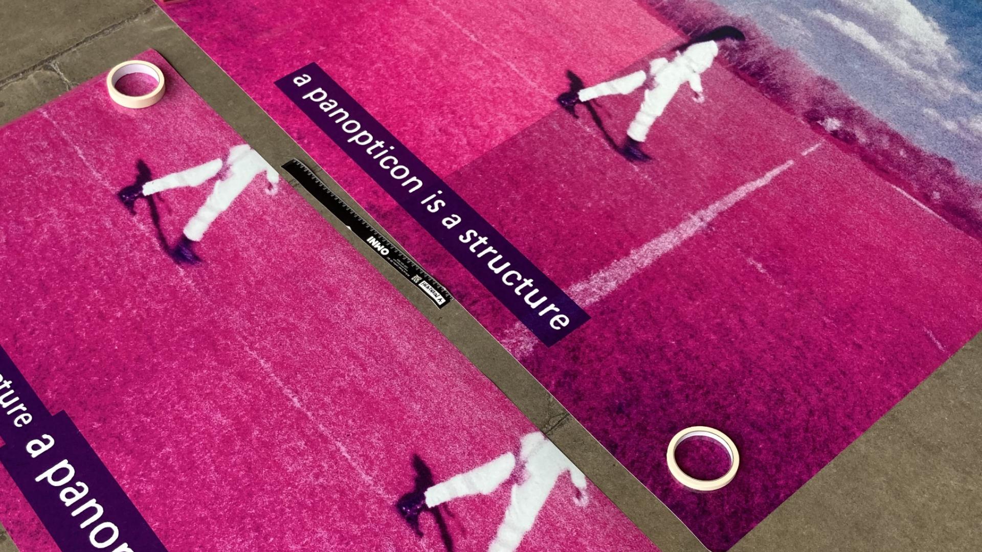
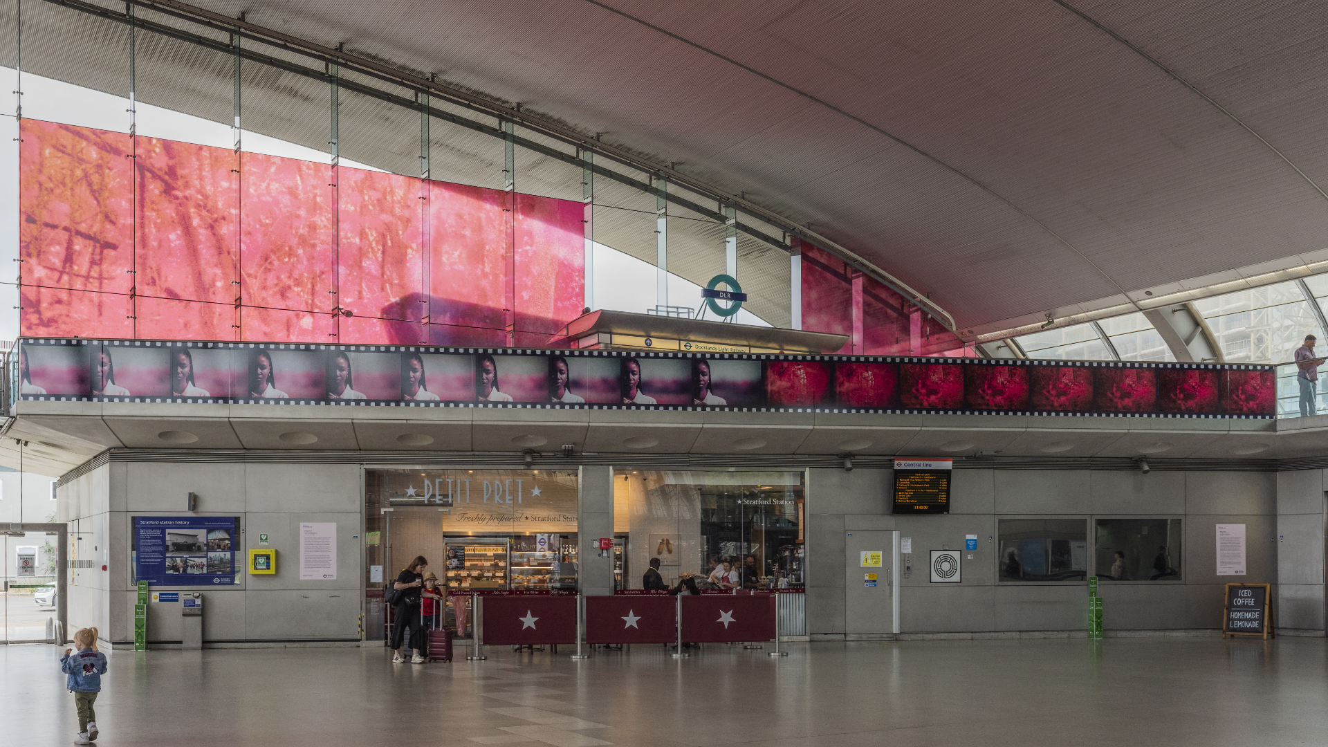
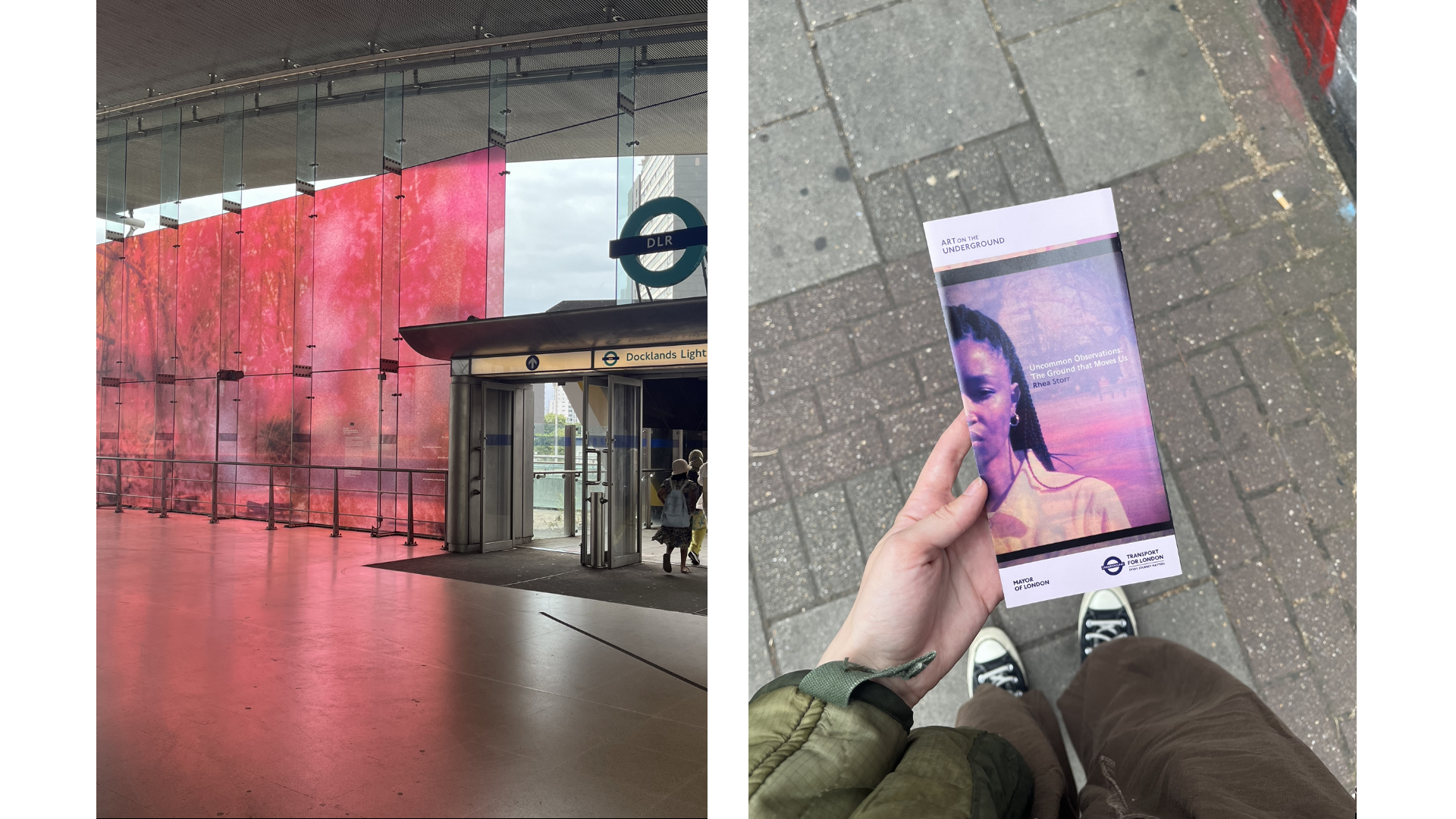
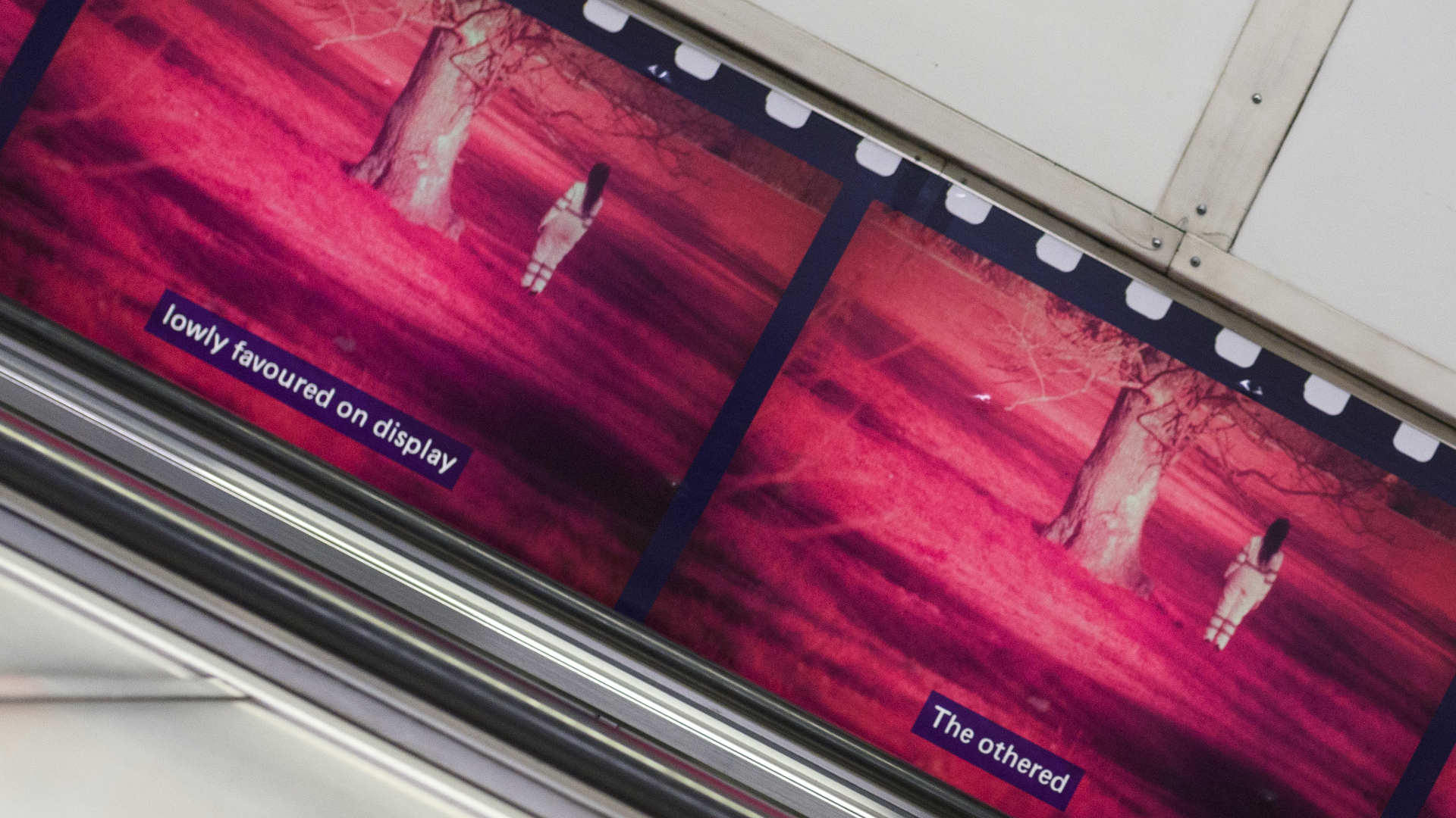
Art on the Underground: Rhea Storr
HATO
June 2022
Art on the Underground comissioned HATO to create the design for 24 boards at Heathrow Airport, escalators at Bethnal Green and Notting Hill, and the mezzanine platform at Stratford station, each featuring visual artist Rhea Storr’s work. The project, entitled ‘Uncommon Oberservations: The Ground That Moves Us’, features a series of large-scale captioned photographs created using an outdated military surveillance photographic film called Aerochrome. The project is one of Art on the Underground’s largest to date.
The design direction focused on highlighting the film element to Storr’s work, including perforated film strip and colour-burned edges for escalator transitions. A blown-up, abstract pixel wall at Stratford links back to the notion of surveillance as CCTV. The typographic treatment includes irregular and slightly disintergrated edges to further compliment the use of film as the artist’s chosen medium.